Describe the craftsmanship of your drawing. (Is it neat and well executed?)
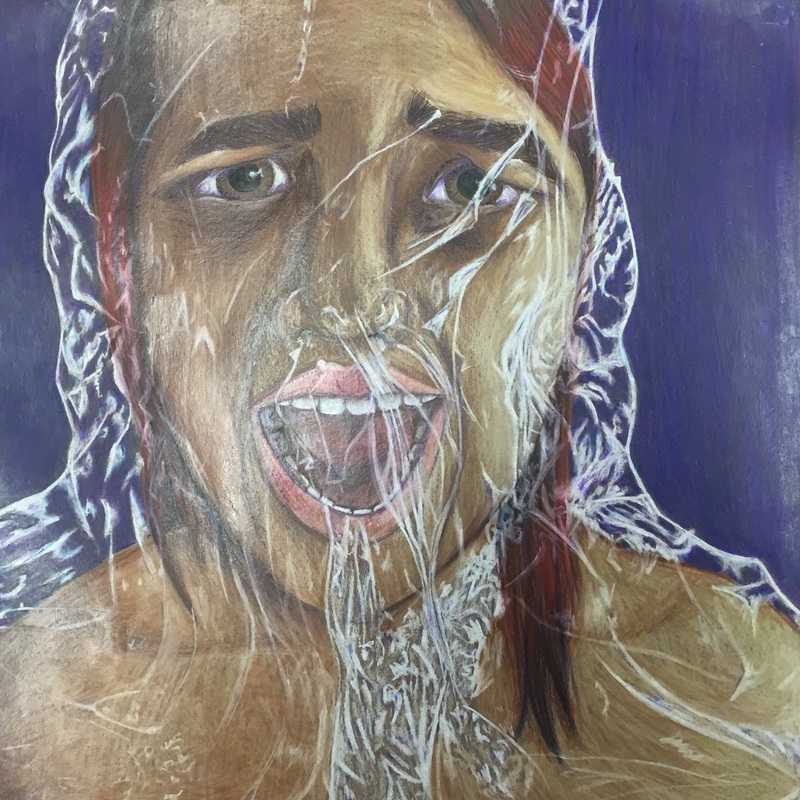
I think I did a good job executing this piece. My lines are clean giving the figure sharp definition. While coloring the skin and adding the values, I followed the contours of the drawing to create fluidity. The contrast between my lights and darks make the facial features stand out and create the illusion of depth. I also feel that I did a fairly good job of making the piece resemble myself.
Describe your choice of colors/color harmonies and how you used them throughout the artwork.
Throughout the piece, I used purple in the shadows. This created a strong illusion of depth. For far away, the purple is relatively unnoticed. However the closer the viewer gets to the piece, the more noticable the purple becomes thus adding more interest to the drawing. For the most part, all of the colors stayed within a brown to red range of colors. This created cohesiveness and an almost monochromatic quality.
How did you create contrast in your drawing?
I used mainly warm tones, such as red, yellow, and brown, to create the figure. For the background I chose to use purple, a cool tone. My use of warm and cool tones created a contrast between the main focus of the piece and the background. This makes the figure stand out.
How did you use textures, highlights and shadows to enhance your artwork?
Typically when I draw portraits the skin always ends up looking like it's made of veto all lines going straight up and down. This normally drives me insane, however, this time I anticipated it and decided to make it work. I chose to follow the contours of the face. This added an interesting texture that adds interest to the face, but unlike my previous attempts it didnt take away from the realism. I actually really like the texture it added. My highlights and shadows create the illusion of depth and add to the realism of the piece. The highlights in the plastic create the illusion that it is covering the girls face.
Why did you choose a particular background color to mount your artwork?
I chose to use purple as the background of my piece. I used purples throughout the piece to add more depth and interest to the shadows. By using purple as my background, I created cohesiveness throughout the piece. The cool purple also adds contrast to the warm tones of red and brown used for the girl.
Discuss the importance of understanding the media (prisma or pastels) and acquiring the skills necessary to create a successful project.
The basis of any good art piece is the execution. You can have a good idea but if you can't execute the idea well the piece looses quality. Through practicing and playing around with the material before starting a piece you can develop a good understanding. Knowing how to maipulate materials makes both the piece look better and prevents you from getting frustrated.
Describe any difficulties you had creating your drawing and what you could do to improve your drawing?
I forgot to start my background before I started the plastic. I debating just leaving the background brown, however, it bothered me too much. I suffered though having to color in all of the little spots. I am a bit upset because the plastic looked better before adding the background, but without the background the piece wouldn't feel complete. If I were to improve this piece I would maybe push my darkest darks even darker. I would also be smart enough to do the background before the plastic.
 RSS Feed
