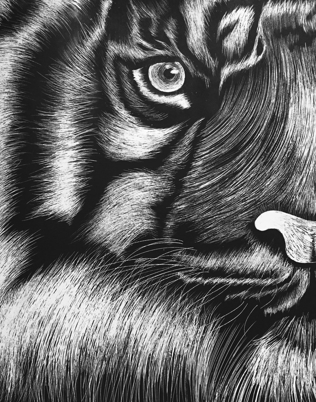
I really like how this project turned out. At first i was a little weary because pen and ink has never been my strong point, and scratch board is very similar. Artist have to add value through layering strokes rather than blending. I was also not really passionate about any concepts or ideas i was coming up with. Therefore, i just decided to make a tigers face which is kind of a cop out. However, i think i executed it very well which makes up for the lack of creativity behind the concept. I think i did a pretty good job showing the different values and showing the texture of the fur. Overall, i really enjoyed working with the scratch board. The repetitive act of making one stroke at a time was almost therapeutic. I am very pleased with how this turned out.
I really liked making this piece. I have always liked drawing faces and facial features, but have never drawn myself. it was quite tricky and i think i messed up the proportions a little, specifically with the nose. I had never used prismas before to make skin tones, so i kind of messed up. I put down the base color before adding the different colors. I should have done this in reverse to avoid getting the streaky look. I also rushed with the hair so i am not a big fan of it. However, i do really like the hand and the scratches. I think i did a great job adding depth to the marks. I also really liked my concept. I wanted to play off my personal flaws. I have a habit of picking and scratching my skin to the point of drawing blood. I wanted to exaggerate this habit in the drawing.
I didn't make this next piece in class, but i wanted to include it in the post anyways. Because i was so unhappy with the way i did the skin, i went home and decided to try skin tones again. This time i think i improved quite a bit. I used purple as the darks to add to the surrealistic vibe. If i were to draw skin tones again, in a realistic setting, i would use the same technique but use more realistic colors. I have a love hate relationship with this piece. I really like the red gum ball machine. However, i hate the blue one. The shading on the red machine (both the base and the actual gum balls) looks very smooth and accurate. I also really like the placement of the highlights and the classic color scheme. The blue machine is the exact opposite. I am not a big fan of the color scheme and the proportions are very off. The bottom part of the machine only holds four gum balls verses the red machine which holds more than six. The actual globe part isn't very circular and the highlights are placed weirdly. However, i do like the shading on the base. Overall, if the blue machine didn't exist i would really like this piece.
I quite like how this drawing turned out. Originally i was not a fan, but after i went in and added the highlights on the candies i ended up liking it a lot more. I really like the ends of the wrappers. I think i did a good job showing the different values and making the wrapper seem transparent. However, the random bump in the candies makes me laugh. I should have been more careful when drawing the line. The drawing would have looked much better if the line had been straight. This was my fifth time working with Prismas and as usual i loved it. I really like the outcome. My use of pinks and purples to create the shading adds an interesting touch. The colors complimented the blue from the raspberries nicely. I think i did a good job showing the different values in the creases and folds. Overall, i really like how this turned out.
I really enjoyed making this piece. I liked working with the chalk pastels, for the most part. The one thing that really bothered me was the yellow pastel. No mater what i did it would always end up fuzzy and not smooth. The blues and greens were very easy to get a smooth effect with, which i really loved. I just wish the yellow was like that too. In general, i think i did a good job showing value and the shadows. I also really like my color scheme. The yellow, greens, and blues go nicely together.
Overall i am not a very big fan of this piece. I think the proportions are off and it throws the whole drawing off. The torso/head are particularly bad. They are just slightly too small, but its enough to throw it all off. I also think the arm is way to small. The shading on the shoe is poor, but thats most likely due to my laziness towards the end. I started to get bored of the drawing and it became evident in some areas.
Although this drawing definitely has its weaknesses, it does have some redeeming qualities. For example i quite like the shading in most of the drawing. I particularly like the shading on the arm. I think it shows all the folds in the fabric and looks fairly real. I also really like the perspective of the whole piece. The concept on having the girl swinging and the shot be from in front/ slightly underneath looks really neat. I am glad i risked getting my head kicked in to get the picture. All in all the drawing isn't awful but it isn't my best. If i were to do it again i would try and improve on the shading and proportions in some areas . I would also try not to let my boredom rush me. When i first saw the arrangement for the still life, the skull immediately caught my attention. Because i was interested in the skull, i think i drew it the best out of all the other objects. I also think i did a good job making smooth transitions from light to dark. I had a difficult time trying to figure out how to show that the bottle was translucent. However, in the end, i think i did a good job depicting it.
Overall i feel i made the drawing a bit too dark. I could have used more lights. I was also rushing towards the end and didn't spend enough time on the fabric. I could have done a better job showing all the folds and highlights of the material. Because i was trying to hurry, i decided to leave out the cords/ropes that were tangled in the bottom left corner. Although this was a smart time management decision, it doesn't stay true to what the original still life looked like. I knew i wanted to draw the skull because it caught my attention immediately. Therefore, i worked most of my compositions around at least one aspect of the skull or antlers. I struggled with choosing between the last and fourth option, but in the end i picked the fourth composition. The last had too much empty space at the top
At first, drawing the Hershey Kiss was a challenge because there are so many creases and bumps. However, when i stopped trying to get every single bump, drawing the kiss became much easier. One of the main problems i faced was getting tired of drawing so many bumps over and over again, which you can see in the last drawing (i got lazy and made the same generic shapes). Overall i like the end product.
|
AuthorMy name is Sarah. I am 16 years old and i am a junior in high school. Archives
May 2015
Categories |