Did you use a wide range of values? (A range from white to black with at least 9 values). Explain how is this evident?
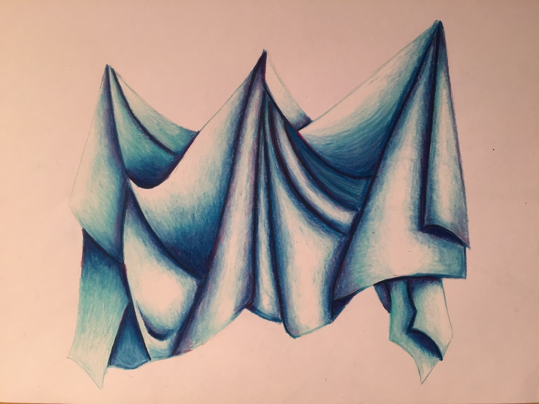
I feel like i did use a wide range of values. I used multiple shades of blue and green, and i added in bits of pink in the darks to create more interest and depth. I've never played with the idea of having very harsh brights and strong darks, so i wanted to try it out. I think i did a pretty good job showing these sharp contrast while still maintaining middle ground between the two.
Explain how your knowledge and creating practice studies with value contributed to your piece.
My studies weren't oriented towards practicing my values. They were more for me to play around with different color combinations. However, I previously took this class and the knowledge i gathered from past projects enabled me to be more comfortable with adding values.
Describe the blending and transitions in your fabric (discuss your use of pressure with pencil/colored pencil/charcoal pencil and other techniques to achieve this).
Because I used prismacolors, the transitions in my fabric weren't very heavily reliant on my use of pressure. In order to get transitions I used different colors, shades, and the addition of whites and "hidden colors" (ex. pink in the darks). Some pressure variation was used when trying to get a smooth transfer from a very light blue to white. I would shade blue very lightly then cover it with white.
Explain how your interpretation of texture is essential in capturing the look of the object.
Depending on how you view the fabric may change the way you represent it. For example, someone may interpret the fabric folds as something smooth and soft. Therefore, their representation will showcase smooth transfers and soft lines. Whereas, I saw the folds as something harsher. Therefore, my piece has harsher folds and shaper contrast between the lights and darks.
If you could recreate your pieces what would you do differently to enhance the final outcome?
If i were to re-due this piece i would add more pinks in the fabric, not just the darks. I did it for one section of the fabric but for some reason didn't continue it with the rest of the piece. I think it adds more interest to the piece and would have kept it from being so monochromatic. However, I kind of like the monochromatism .
 RSS Feed
